
Organizations looking for ways to effectively monitor and enhance the data in their systems may be lacking the needed visibility into their business process flows and projects to make impactful changes.
This article addresses Microsoft Power BI use cases we have identified and helped implement within our utility clients to demonstrate how organizations can harness the software to ensure continuous improvements across data projects and business, relating to data quality, work order lifecycle management, and information sharing and communications.
Services Overview
Power BI Overview
Power BI, an interactive data visualization software product, can be leveraged by the utility as a discovery tool to target business process improvement areas on data related projects. Customizable according to a utility’s project requirements, quality standards, and reporting needs, the versatility of the software renders it applicable throughout the organization.
The software compiles project data into visualization tools for easier interpretation and analysis. The data tools can be tailored to a utility’s individual keystones for success and grouped into focused dashboards, with various display options to help visualize and highlight the same data in different ways. This flexibility can provide value at the project level as well as the executive level as project information can be stored in detailed tables alongside high-level charts and graphs within the dashboards.
Improve Data Quality on Work Order Posting
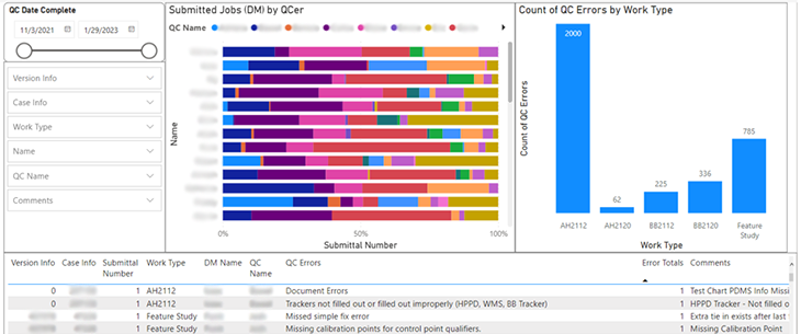
To track work quality on data projects, managers may currently be required to manually gather information from multiple systems and resources, which can make it challenging to accurately monitor project health and actual data quality. Power BI provides an efficient approach to confirming and tracking GIS production work quality as all the project data is stored and processed in one location.
One of our clients is applying the software to monitor the work quality of its editing and quality control (QC) teams for a work order posting project. The manager can keep a pulse on both teams in parallel, which helps with identifying work quality trends and existing knowledge or business process gaps across all aspects of the project. Equipped with this insight, the manager targets and implements actionable process and quality improvement steps where needed.
Identify Work Quality Trends
Using different chart variations and color, Power BI makes it easy to spot project data patterns and trends, so managers can quickly recognize and curb any issues with teams or individuals.
A UDC client uses chart colors to visually monitor the amount of work order errors made by its editing team, as demonstrated in the chart below. A mostly green chart indicates a low number of errors or higher work quality, while the presence of other colors alerts the manager to editors with higher error rates than the average.

Identify Business Process Gaps
The identified trends can be leveraged to help determine whether work order errors correlate to gaps in training, documentation, or processes based on the nature and consistency of the errors. If there are common errors across the editing team, then these may require addressing on a project level. On the flip side, data outliers can help determine if an editor is below the curve and needs extra help.
View Historical Data for Comparison
The data timeframe of tools within a dashboard can be updated simultaneously using a date range widget, allowing the manager to view data statistics from any point of the project. Applying this functionality, managers can view the progression of a project, team, or individual as well as determine whether gaps have been effectively addressed or if more support is needed.

Our client creates shareable, targeted reports using the historical functionality to highlight specific project metrics and provide overviews of project performance in briefs. These reports also assist the manager with comparing the productivity and quality of an individual’s work against the overall average of the editing or QC team.
Manage Work Order Posting Lifecycle
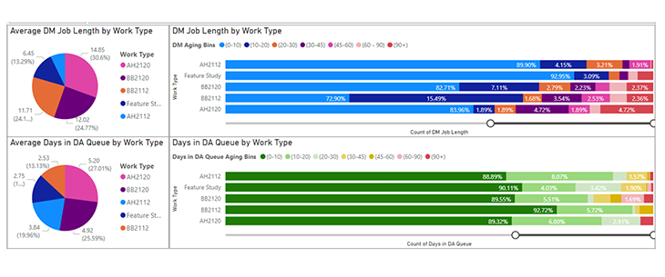
Maintaining data currency within the GIS and operational systems is a hurdle that many utilities are faced with on data maintenance projects. Through Power BI, utilities can effectively monitor aging work orders and turnaround times to help ensure their compliance with data latency regulations and laws.
Using the dashboards, managers can see at a glance the number of work orders that have been sitting in queues and for how long. In the example below, the age percentage of each work order type is depicted across the editing and QC workstreams along with the average amount of time to complete each work order category by team. Our client uses these charts to flex their cross-trained editors and QCers between workstreams based on the workload and priorities in each queue.
Streamline Data Project Communications
In addition to enhancing project data quality, Power BI can also help improve project communications. With charts and graphs readily available, managers can easily share project information with their staff, peers, and executives to drive discussions around project metrics, workload forecasts, key performance indicators (KPIs), and company or project goals, for example.
Teams that work closely together on data projects, such as editing and QC, can leverage the dashboards for more constructive collaboration in meetings by using documented project statistics to facilitate conversations around data trends, issues, or gaps.
Document Performance Records
A record of every work order is maintained within the software throughout the work order lifecycle, unless deleted in the data source. Our client references this data to create documented performance records for internal and external project technicians and to support discussions involving performance indicators and markers and promotions.
Improve Work Order Feedback
Power BI can help streamline feedback communication between the editing and QC teams on data projects. The QC team of a UDC client uses an error picklist in the data source to document the errors made by the editor for each work order. Synced to the dashboards, this helps to create consistency with editor feedback as well as enables the errors to be summarized in a chart for high-level reports. The charts are used in weekly, collaborative meetings between the editing and QC teams to review the data and determine if any errors need to be addressed as a project team.
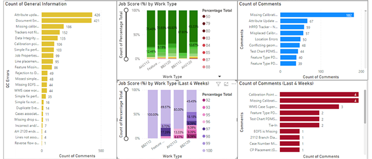
By configuring a chart with the overall error comments beside a chart showing only the errors made over the last four weeks, our client can easily compare the data to see whether improvements have been made over the last month.
Reaching Your Data Quality Goals
Microsoft Power BI Dashboards provide utility organizations more visibility and insight into their data maintenance and quality projects for streamlined management. Leveraging the interactive tools, utilities are empowered to make continuous project and process improvements using current and historical data to track data quality gaps and trends, visualize work order posting status, and provide feedback to team members based on documented results – all helping them to achieve their data quality objectives.
To learn more about our Data Maintenance projects or how we can help you apply Power BI in your organization, please contact us.